Marketing emails are standard practice for keeping in touch with customers. But if you’re like me, your inbox is overstuffed with dozens (ok, hundreds thousands) of unread emails. In this age of email saturation, how do you design an email that knocks readers’ socks off? Or, if you’re selling socks, puts socks on’em?
In this post, we’ll explain what great email design looks like and describe some best practices you can use to improve your own emails–helped by a few examples from companies who are doing email design right.
Structure is Key
Successful marketing emails nail the following components to convert a reader into a customer.
- Subject Line - Short, relevant, and clever. (Fun Fact: 47% of people open email based on the subject line alone.)
- Preview Text - The first few words of the email which entice your audience to keep reading.
- Hero Image - Primary design element that supports the main message of your email.
- Body - Clear and concise messaging, driving to conversion.
- Call to Action (CTA) - Obvious links with an optimized landing page.
- Footer - Contact info, social profiles, and, most importantly, an unsubscribe link.
Killer Subject Line
Great emails start with great subject lines and, as if it weren’t difficult enough to figure out what your message should be, you can now use emojis to make sure your open rates are 🔥.
Subject lines should be shorter than 50 characters and entice readers into opening the email, but be careful not to use words like "free" or anything else that might trigger a spam filter.
Buzzfeed has mastered the art of the irresistible subject line by making small promises that they can follow through on in the body content–so users usually get what they pay for (or click on). They know exactly what will draw their audience in and stay true to their brand and snarky voice.
They also make stellar use of the preview text to give readers that little something extra to get engaged. Here are some examples of Buzzfeed subject lines and their preview text that may or may not be from my actual inbox and an admission of my Buzzfeed subscription:
Not Cool, Guys
Okay, WHO left the passive-aggressive sticky note on my fridge. Honestly, who acts like this?
Which Mythical Creature are you?
We’re all unicorns on the inside.
Are These Historical Medical Treatments Real Or Fake?
Medical advancement has been a crazy ride, y'all.
Close The Loop
These subject lines are enticing because they create an open loop, leading you on, and either posing a question or making a vague statement while purposefully not giving the full story.
Take, for instance, Which Mythical Creature are you?
Your mouse hovers over the delete button, your brow starts to sweat–this is your one chance to have your long-held belief that you’re part mermaid verified by an outside source. You just have to open the email.
Marketers who take advantage of this technique often see increased open rates–but make sure that your email closes the loop and answers their burning questions, otherwise, readers will feel burned–and might just click that unsub link.
Get this look: Pose a compelling question that leaves your reader itching to close the loop, written in a voice that’s on-brand for your company and with phrases that will appeal to your specific audience.
Strong Copy
Remember those thousands of unread emails in your inbox? You don’t have time to read them, and neither do your customers. Keep it short and to the point.
While writing a 10,000 word essay may be out of fashion, your body copy is nonetheless your best opportunity to create a conversion and close the loop you opened in your subject line. Make sure your primary point is above the fold and tells a compelling story.
This email from Poncho, a company that sends personalized weather reports coupled with gifs and stellar puns, utilizes clean design and punchy content to tell the reader only what they need to know to be prepared for the day.
They certainly don't "Plait it safe" with puns to lend personality to their copy:
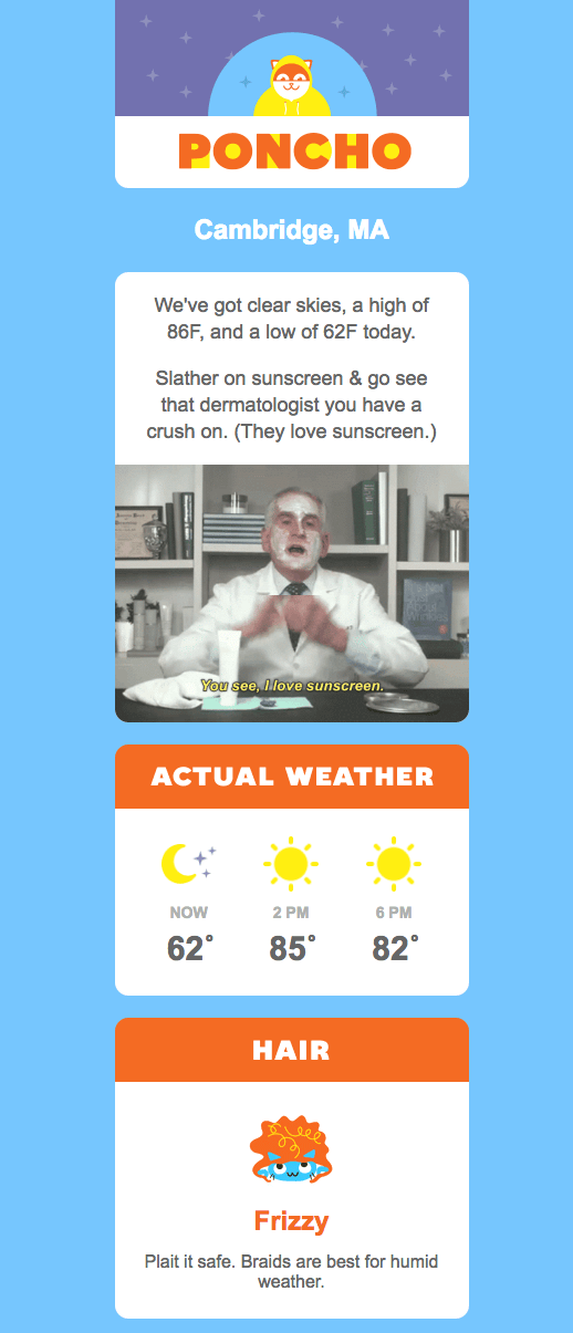
Get this look: Write copy that is compelling yet easy to read (and skim).
Thoughtful Design
Hierarchy and organization play a critical role in the success of an email, and since emails with a single CTA increase clicks 371% and sales 1617%, the CTA should be front and center.
What should that CTA be? Certainly not “Click here” – the highest-converting CTAs have a clear action that will happen when the customer clicks (i.e. “Shop now” or “Start saving”). CTAs with strong, actionable language convert higher than vague promises.
Uber is serious about their brand design, and this email example combines the use of copy and design to create an effective Call to Action. It follows the brand’s standards of colorful geometric design and emphasizes its messaging with two links to "Sync Now."

Get this look: Write clear and succinct CTAs that focus on what you want your reader to do.
Mobile First
Not all screens are created equal, and trying to read an email designed for a desktop monitor on a smartphone is one of Dante’s lesser circles of hell. With 56% of all emails now opened on mobile devices, mobile-first email templates are something marketers have to get right to stay competitive.
This email from Apple was designed with mobile readers in mind. It contains minimal copy with a defined CTA and a single column layout with images that don’t overwhelm the reader–and that aren’t mission critical if they don’t load properly. The links are obvious and easily tappable while on the go.
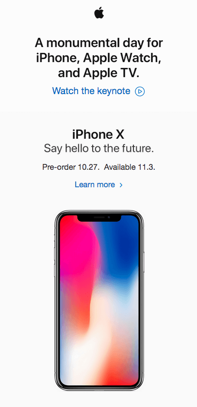
Get this look: Get to the point with a clear CTA and oversized links; remember that horizontal scrolling is an unforgivable sin.
About that footer
At the end of your email, after your CTA, you should link to other ways to get in touch with your company: your domain, social media, and an unsubscribe link.
By law, you’re required to display your mailing address and an unsubscribe link in a bulk, commercial email. Some marketers are tempted to conceal the unsubscribe link by making the text color very close to the background color or some other trick–but we’ve found that clear unsubscribe language is the right thing to do. If someone doesn’t want to read your email, give them an easy way to opt out–it will make your open and click rates more accurate, and let you focus on improving the conversation with the customers who do want to read what you have to say.
Test and Test again
We’ve all done it–as soon as you push send you realize there was one giant typo in the email. Or a broken link. Or maybe something more subtle–like the layout was broken on a certain browser on a certain device.
If you can, try to have another person read the email before sending it–no matter how amazing you are, another pair of eyes can help.
At Lightboard, we use Litmus.com to test all our emails–both our own and those we design and send on behalf of our customers. Litmus will test to make sure all of your links work and show you previews of how your email will render on the most common devices.
Putting it all together
While there are no hard and fast rules when it comes to email marketing, these standards are a great place to start:
- Effectively hook readers using subject lines that are short and relevant to readership.
- Write clear, succinct copy that converts a reader into a customer and closes the loop opened in your subject line.
- Remember that half your opens will be on a mobile device.
- Test and test again.
P.S. I'm a Unicorn.