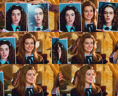
Makeover. Transformation. Glow-up. Everyone loves a good before-and-after–who can resist? We love them, too, and we like to think it's what we do every day when we bring a customer's idea to life.

Sometimes the raw material is an unformatted Word document or a pencil sketch. Other times it's an old design that has been tweaked and twisted over the years into a mess–and it's our turn to brush off the rust and give it a new life.
Seeing a design before-and-after is a great way to appreciate the work a designer does to transform an idea into a finished product. Here are a few examples of what design can do.
From Word to Delight
Our customer, Talkspace, wanted to turn their therapy checklist–which was just a Word document–into an eBook they could use as a lead magnet. Ain't nobody going to download a Word document, but after a little illustration and layout magic (👩🎨✨) we ended up with a polished set of PDFs that flew off the digital shelves:
Spicing up a Sales Deck
PowerPoint is a great way to get ideas onto the screen–and with it even the clumsiest design enthusiast can create a great starting place for a designer.
Here are three before-and-after slide deck transformations to demonstrate how design can turn an everyday slide into something remarkable:
From Stock Image to Custom Illustration
Nova Credit came to Lightboard to create onboarding illustrations for their product–a great way to lend personality to their brand. The challenge with custom illustration is both coming up with the scene (what are we going to illustrate??) and the style. After a lot of back and forth, we delivered a set of illustrations we all love. What started from a cheezy stock image ended up with an adorable illustration to supplement copy describing how Nova's search engine works:
Total Brand Makeover
✨ Are you ready for the grand finale? ✨
We worked with Usermind to do a complete brand refresh. This multi-stage project covered everything from a rebuilt brand identity to reimagined sales deck and collateral, rebuilding their website, and executing the identity across everything from business cards to booth design. This is a great example of how an investment in design can bring your brand to the next level.
🦄 Bonus: GIF Edition
OK OK this isn't technically a before/after, but it's mesmerizing and shows how an illustration goes from sketch to finish product. This editorial illustration headlines an article on architect communication for Autodesk’s Redshift blog (see the article here).

Does your brand need a little freshening up? Drop us a line to get started.
